

Small Business Website Redesign
A website for a small consulting business that works with sales organizations to improve their product demos.


Client Testimonial
“Jacob took the time to really understand my business and my customers, and his final design was a wonderful combination of my vision, my customers’ perspective, and his own ideas. What impressed me most about his work was his keen eye for detail – everything from the overall page design down to the button colors was intentional and thoughtful.”
Project Summary
Company: Demo Solutions
Goals: Attract customers by showcasing the business’ consulting services. Provide useful, free content to prospective customers. Establish credibility and expertise in a niche consulting space.
Solution: High fidelity visual design, information architecture, and branding
Impact: Website launched
My role: Designer
First, I met with the client to discuss goals, vision, and scope.
We discussed questions like:
business goals and outcomes
what the client liked and disliked about their current site
goals for the project
time estimates and pricing
project scope
target customers
They already had a blog with lots of posts and strong SEO. The goal was to create a look and feel similar to a SaaS business site, while communicating all of the important points about the business.
Output: project brief
Tools used: Google Docs
Next, I designed the information architecture.
To achieve the client’s goals, we needed a clear system for organizing information across the site. I designed an information architecture with these goals in mind:
emphasize the business’ various solutions
transparently communicate pricing
showcase their educational video and blog content
feature customer testimonials
Output: information architecture diagram
Tools used: Lucidchart
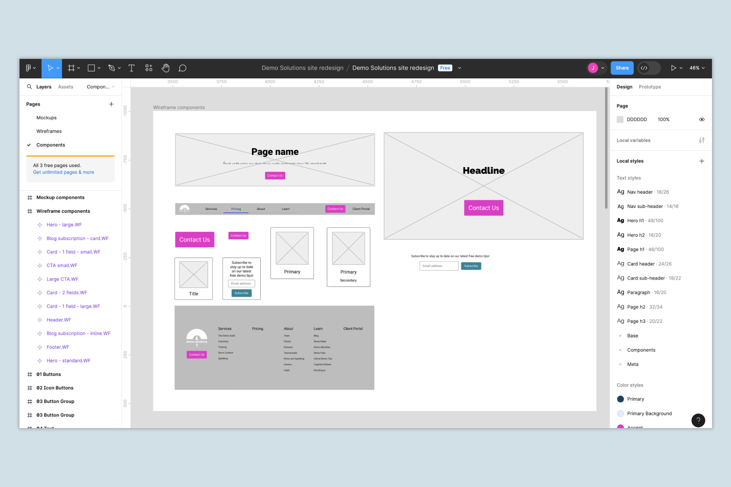
Then, I created wireframes to ensure that my vision aligned with the client’s.

The wireframes showed how each page would be laid out. Equally important, they helped communicate how the site would tell the story of the business starting when a visitor landed on the site. I reviewed the wireframes with the client, which led to us tweaking some details with the layout.
Output: wireframes
Tools used: Figma
Finally, I turned the wireframes into production-ready, high-fidelity designs.
Finally, I created high fidelity designs that were ready to be built. To improve efficiency, I first created a design system which included:
a set of reusable design components
a color palette including primary, secondary, and tertiary colors to represent the brand and ensure that the site was easy to navigate
illustrations for the landing page, using stock images as a starting point
graphics to represent the business’ services
Then, using these elements as a foundation, I created the finished designs.
Output: development-ready designs; reusable design components.
Tools used: Figma